

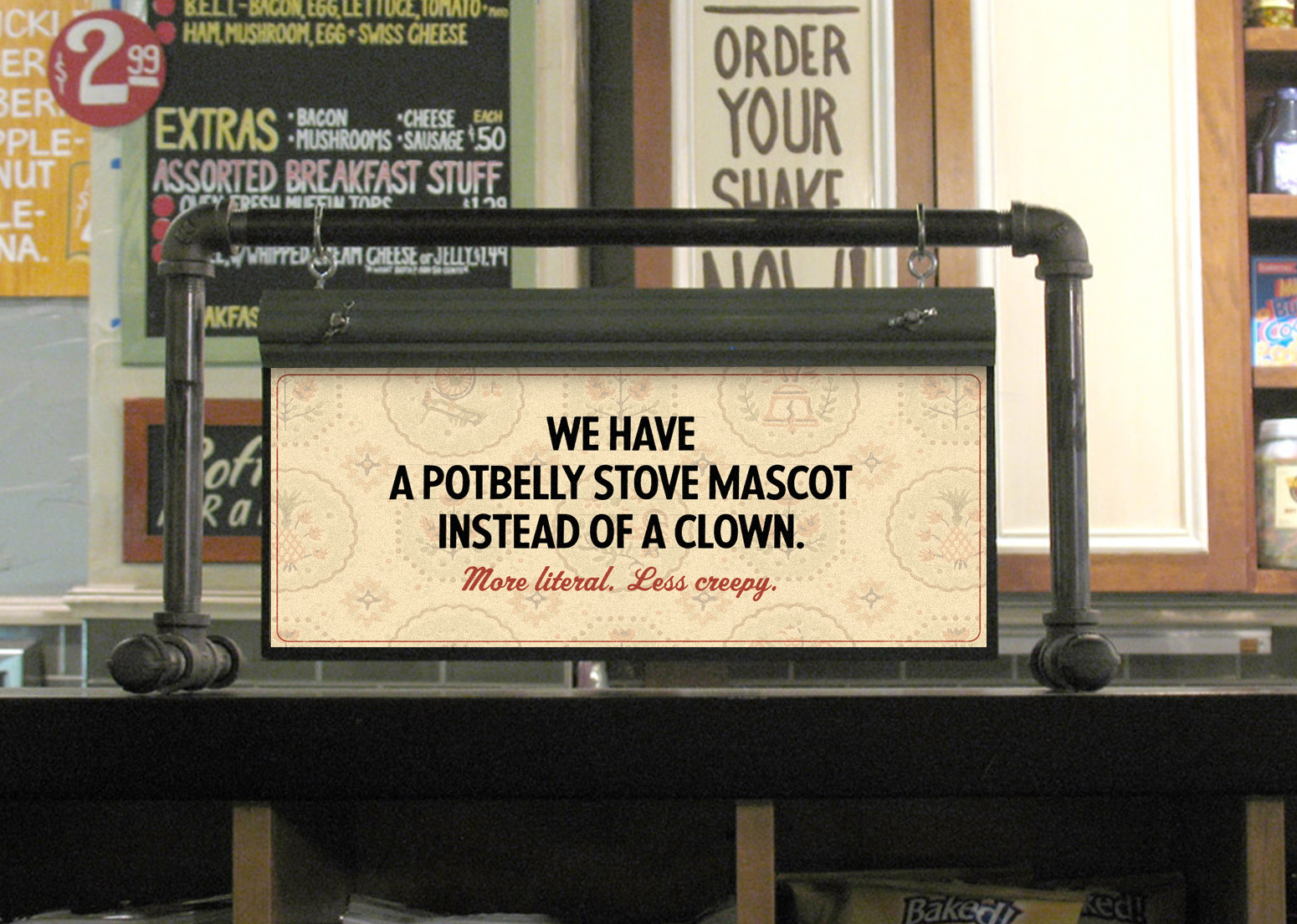
We began working with Potbelly when they were just three locations. We did it all, from the way the brand looked at any touch point, from the ads to tray liners. Over this period they opened over 500 locations. And before you go wait that’s not the Potbelly logo? Well, the CMO at the time was an Ex-Chipotle guy who wanted to evolve the mark and this work was a transition to that evolution. But as you’ll see by the end of this story the CEO wanted a return to the crazy mash up that is Potbelly.


Created the look, feel and general vibe all the way down to a mark for their training school - “Potbelly U”.


These interactive emails were sent to our very robust email list. The brand garnered astonishing loyalty, (anybody willing to give up their email address is very loyal) and along with paid search these targeted messages were very effective. In fact they won a Webby Award.

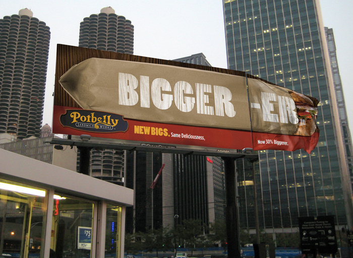
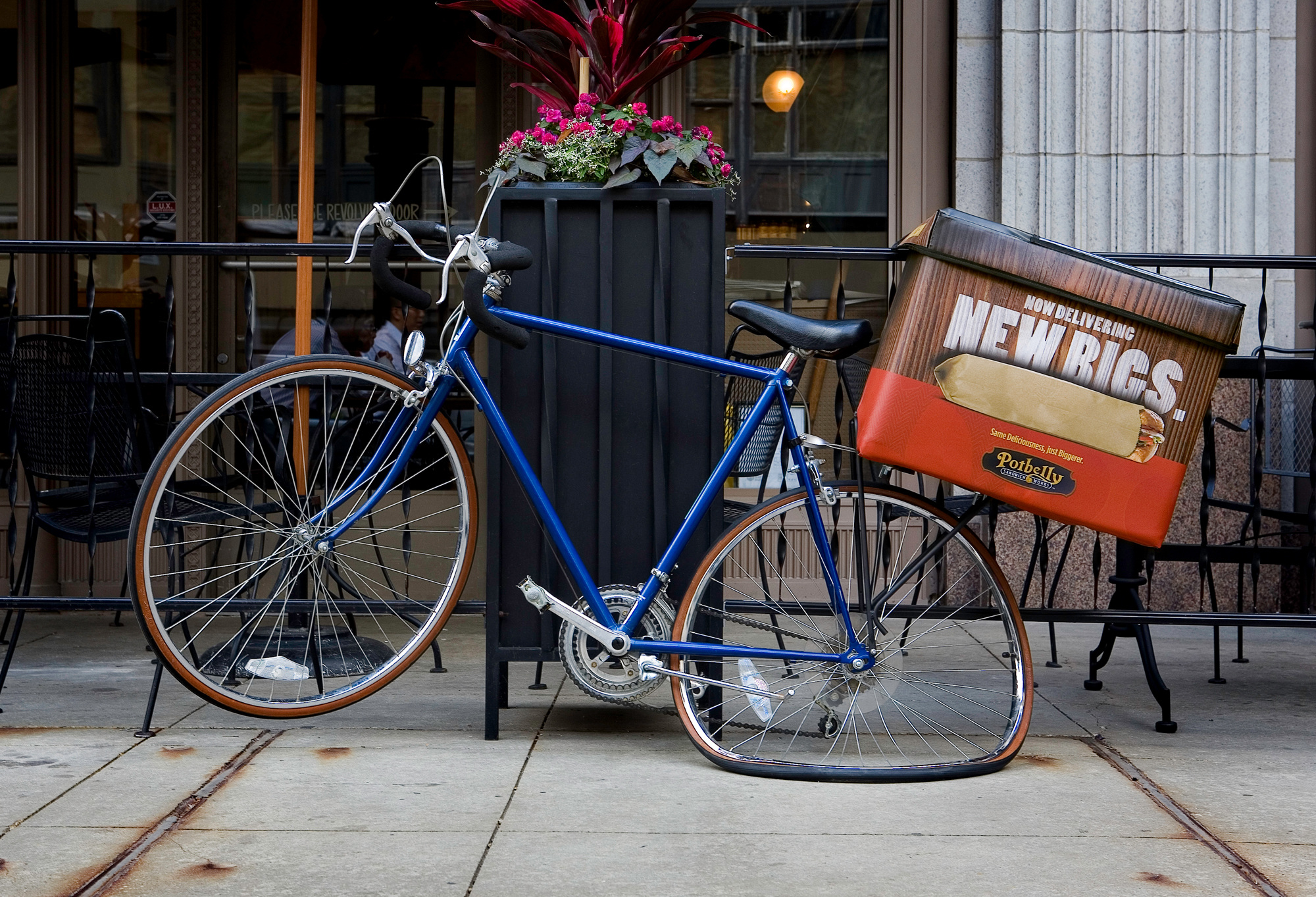
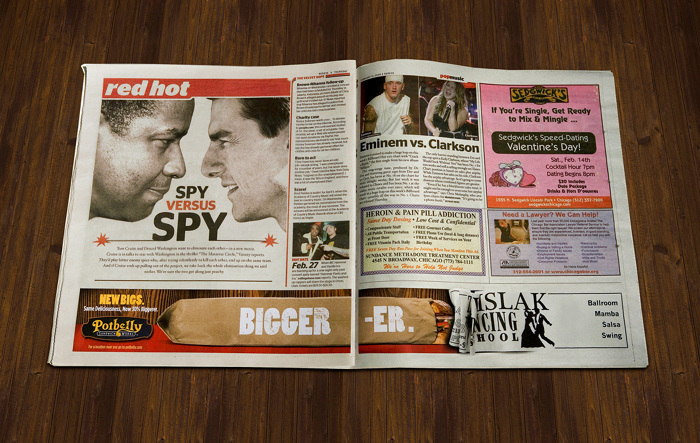
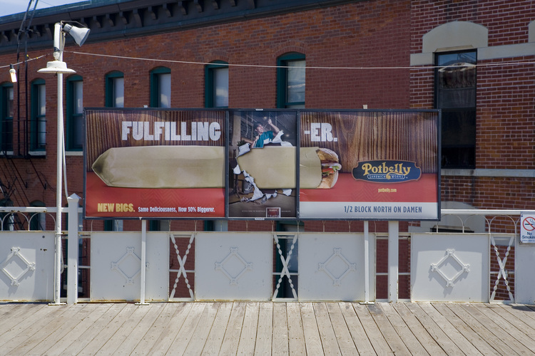
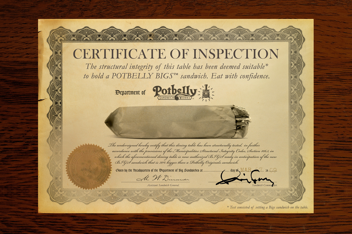
This was a new product launch. Bigs were, you guessed it, a bigger version of their classic sandwich.
This guerrilla/traditional campaign was all over Chicago and won a Gold Addy.