


MAVEN is a car sharing startup from General Motors. They are rolling out all over the US. The challenge was to build a brand from the ground up. One that’s all about connection and bringing people together rather than about cars and dollars per hour. A true life-style brand. The video below is the core of the idea: Today's world of connecting online, is actually making people feel more isolated. The visceral feeling from shaking your clients hand, hugging your sister or kissing your loved one cannot not be replaced by a laptop or a phone. You need to physically "Be There." Without any television support, MAVEN is beating the client’s very aggressive projections in every city they have launched in.
The SpiderWEB effect.

The idea was to launch online with influencers. How original? Well, the approach we developed was. Place a "Maven" in the middle, someone who had expertise to share but didn’t necessarily have a ton of followers, then surround them with a group of influencers who do have a ton of followers and contract them to share the experience through their channels. This spiderweb magnified the engagement a thousandfold and lead to us surpassing our very aggressive goals. We personalized all the videos for the cities they were launching in. The research lead us to concentrate the subject matter on topics our demographic was seeking out online - music, cooking, fitness and a few others. Below are a few of the many films we shot for city launches.
I know when you saw the words General Motors you thought: unlimited production budgets. But GM had a novel approach - they would act as the venture capital behind the company so they could keep it separate from their dinosaur structure and indeed behave like a startup. Fast, nimble and doing things on a shoe string. All very much the opposite of GM’s model. And these films, while not free, were done very affordably all in line with the new paradigm MAVEN was establishing.

Of course it was more than just online videos.
We produced everything from outdoor to web design to a robust facebook presence and everything in between.


You earn miles for flying so why shouldn’t you earn them for driving?
Real World Results:
From 0 cities to 14 cities across the US.
From 0 to over 200,000 registered subscribers across the U.S.
“We have been growing 10 times month over month, so we now have 250 million Maven miles [driven],” CEO Julia Steyn said. “I think the goal is very simple, and it is to remove barriers from sharing in the broader sense.”
A note on authorship: This is the only mark on my site that I did not design.

Even though the Humane Society of the United States is a long-established institution located in Washington D.C., that has more than ten million members and fights for the rights of all animals, everyone kept insisting it was the place in their city, “where I got my dog”. The Society had an identity problem. The challenge of giving it a national sweep, dedicated to more than cats and dogs, is what lead us to think differently. And how do you incorporate a visual of an animal in this case? It posed difficult graphic conundrum in that no one animal could be representative of all the work they do and indeed could even further cement the dog shelter confusion people already had in their heads.
All the animals in the new mark were carefully selected to represent a cross-section from the land, the sea and the skies of America. From domestic to wild, endangered to abundant, they each had a specific purpose of depicting the scope of the HSUS causes. Now take them, lay an animal mosiac creating the entire country and a logo is born.

The old mark lacked mission, purpose
and any sense of being humane.

The mark needed to be expanded into a complete eco system/program that supports the master brand. They needed to stand on their own for their unique mission and yet relate to the master brand. The animal silhouettes, illustrated by Michael Schwab, proved up to the task. And give credit where credit is due, it took the talents of the art director, Malgorzata Zawislak as well to bring it to life.


The next challenge was to bring it all to life in powerful ads about serious issues. We discovered the familiar practice of photos of abused dogs, just motivated people turn the page as quickly as they could because, “they just couldn't take it.” So, instead of engaging them they were repulsed. These posters informed without the all too visceral shock of photography and steered them to a way to help. And since it coincided with the introduction of our new logo, it helped cement it into the American psyche.


Becoming part of pop culture is what every brand strives for and being an organization that fights for animals made it a lot easier to get into the main stream media.
This was a very particular project that dealt with dog fighting. It went hardcore to stand out. Challenging the belief that real men were nothing of the sort if they stood behind dogs as they did the fighting. The HSUS offered up a reward for information leading to breaking up this barbaric sport.


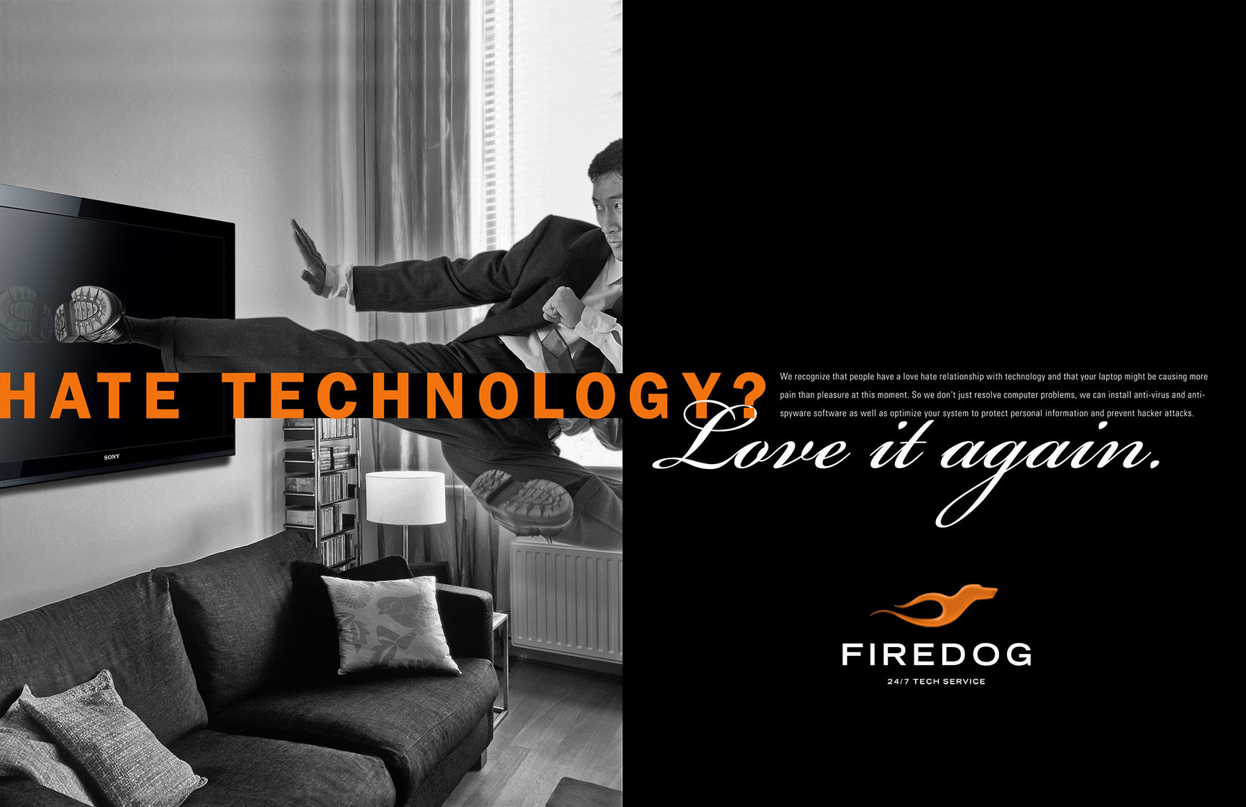
A large consumer electronics retailer was interested in getting into the consumer tech services business and came to us with their name “firedog” in hand. So that was a given from the get go. The core idea was a simple one based on a commonly held belief with today’s tech consumer, “technology is great, when it works.” So, I love it when it works and quite the opposite when it doesn’t. The mark was designed to be clean simple and eventually could be used without any typography it was so distinct. Unfortunately, that large retailer was Circuit City and we never got to see it play out in the market.

The ads were designed to tap into that frustration we all have felt over the years dealing with our devices. And although we have never destroyed them (well almost never) we certainly have felt like doing it. But wait, Firedog to the rescue.


As with any new brand we had to design everything from employee uniforms to in store signage to the trucks.

The proposed television and online video imagined a world where our relationships with our technology were the ones we always wished we had. Firedog associates were positioned as therapists that could fix your rocky relationship with your laptop or any tech that was giving you problems.

MarkOne is an automation company in Michigan. They have a very unique position in the manufacturing industry in that they have a line of green equipment that eliminates the waste that is usually associated with assembly line equipment. The first job was to update their look, (see insert of their old website). Then find a strategic position that reminds Detroit that ecological consciousness begins in the factories. They are not very green let’s just say that. If they have any ecological story it’s usually in MPG and electric vehicles. MarkOne’s equipment re-filters the water it uses so it all but eliminates the waste usually associated with this type of equipment.

The old look, feel and positioning were mired in the 80’s and definitely needed to be repositioned for today’s world. Does this look like a company that mainly sells robots?


BRAND EXTENSIONS: The company’s edge comes in innovation. This mark was designed to firmly place the “GreenCleen” line of equipment in the corporate graphic vernacular and it allows them position themselves as a company of the future. (See below trade ad).

AD COPY: Low emission or even no emission cars have gone a long way to cutting greenhouse gasses but it isn’t the whole story. Manufacturing is riddled with ecological questions and challenges. At Mark One Corp we have a complete line of metal washing equipment that recycles water again and again...and again. Eliminating the need to dump toxic waste over the lifetime of the equipment. Automation for a greener more profitable future.


Bachrach, a chain of men's stores, has been around since 1877. But in 2012 they were struggling to find an identity. You can tell it was a challenge for them because even the store in 1877 had two different logos on respective facades of their store, which Bachrach's was I going into? That question persisted right up to today.

When we started with them they had retreated to a neutral look that felt more generic than it did a brand that a man would be proud to wear.
When we presented the new mark it was more of a brain dump. But one with a plan. How many times have you heard in a meeting like this, “did you look at doing it _______ way?” This presentation stepped them through all “ways” we looked at the problem and that drove the process to a seemingly inevitable conclusion.


The advertising took the stand that tapped into our core consumers psyche. Sure it helped to be well-dressed but in the end I’m the reason.
I’m the man that get’s the job, the girl. It fed their ego and created a fresh idea in the fashion world, (which is no small feat in itself).


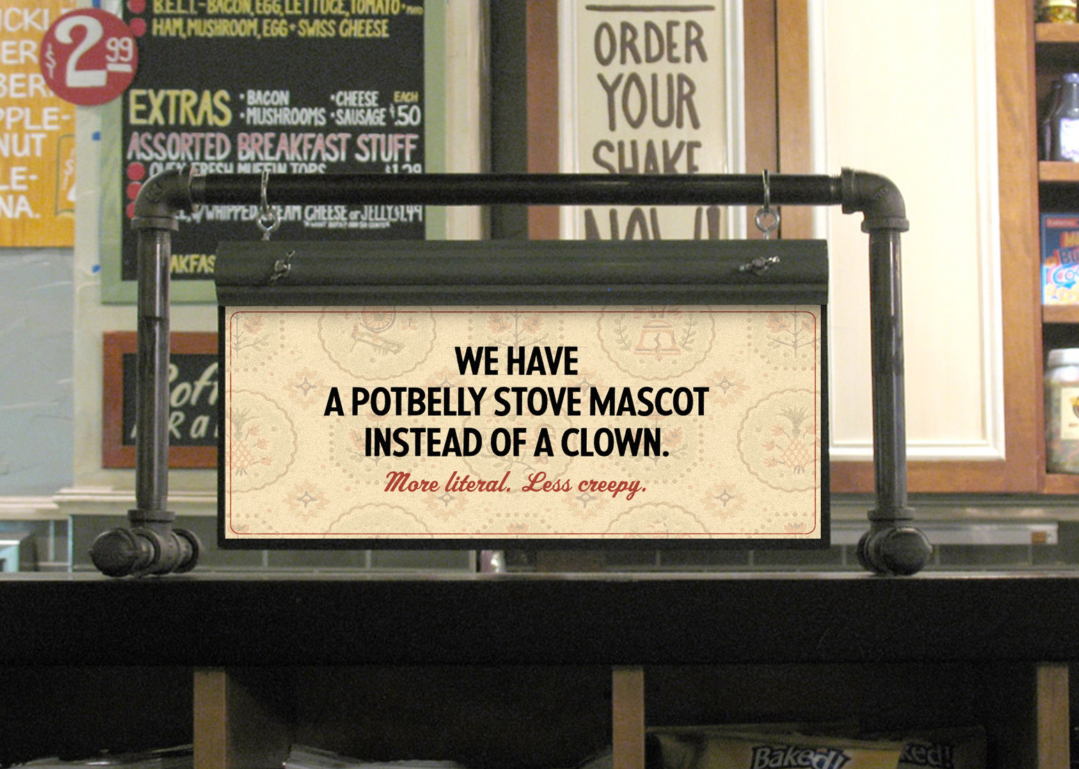
We began working with Potbelly when they were just three locations. We did it all, from the way the brand looked at any touch point, from the ads to tray liners. Over this period they opened over 500 locations. And before you go wait that’s not the Potbelly logo? Well, the CMO at the time was an Ex-Chipotle guy who wanted to evolve the mark and this work was a transition to that evolution. But as you’ll see by the end of this story the CEO wanted a return to the crazy mash up that is Potbelly.


Created the look, feel and general vibe all the way down to a mark for their training school - “Potbelly U”.


These interactive emails were sent to our very robust email list. The brand garnered astonishing loyalty, (anybody willing to give up their email address is very loyal) and along with paid search these targeted messages were very effective. In fact they won a Webby Award.
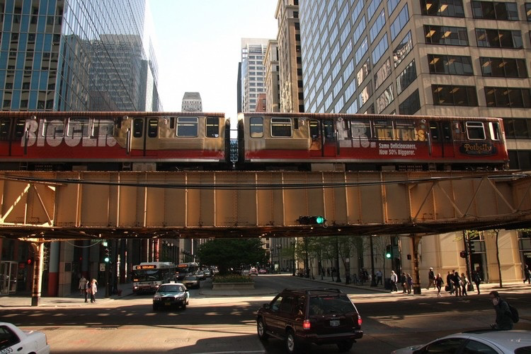
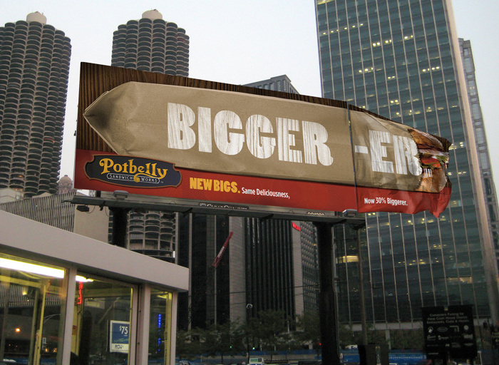
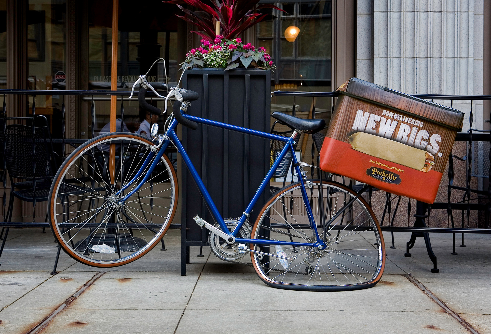
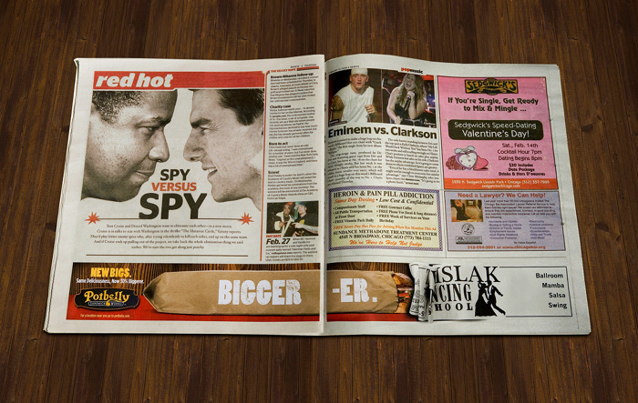
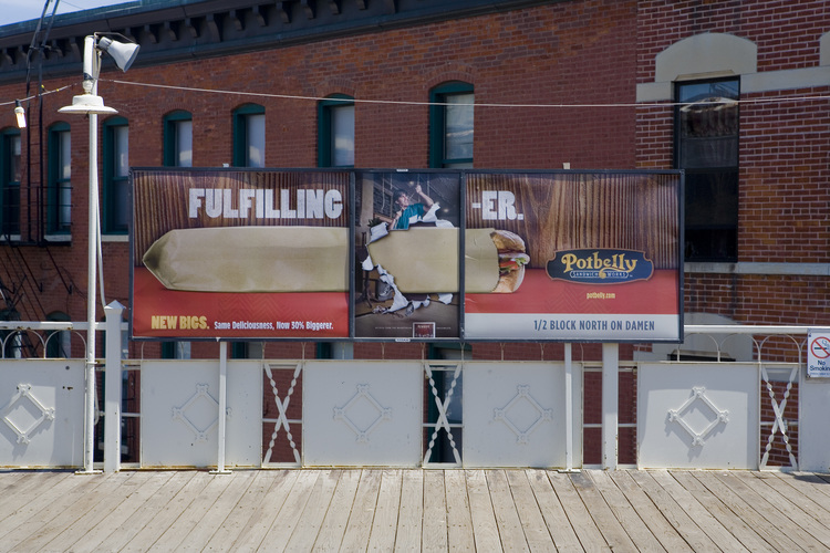
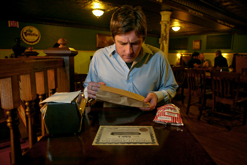
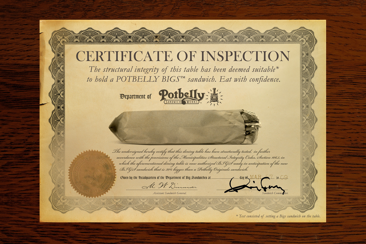
This was a new product launch. Bigs were, you guessed it, a bigger version of their classic sandwich.
This guerrilla/traditional campaign was all over Chicago and won a Gold Addy.


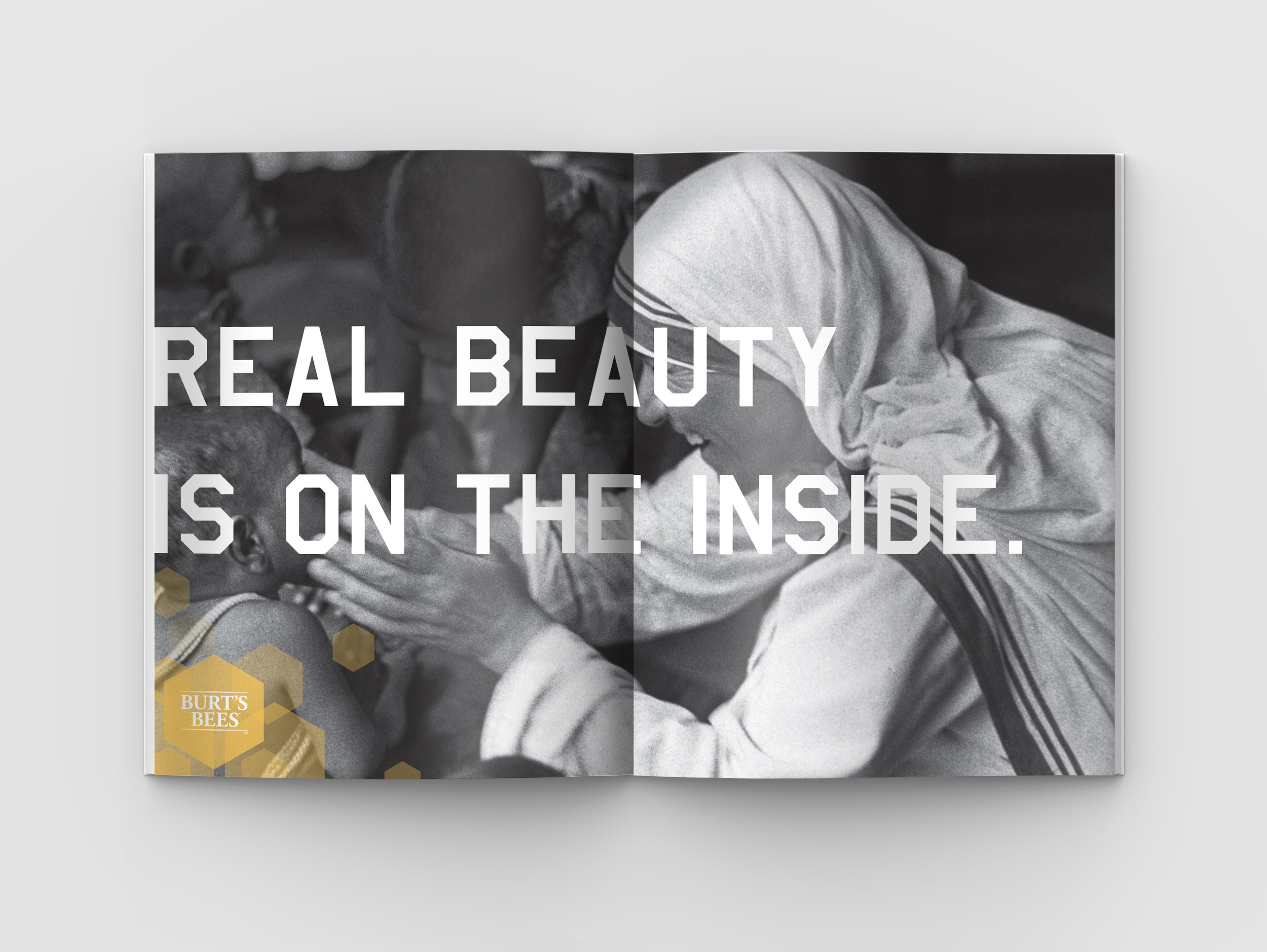
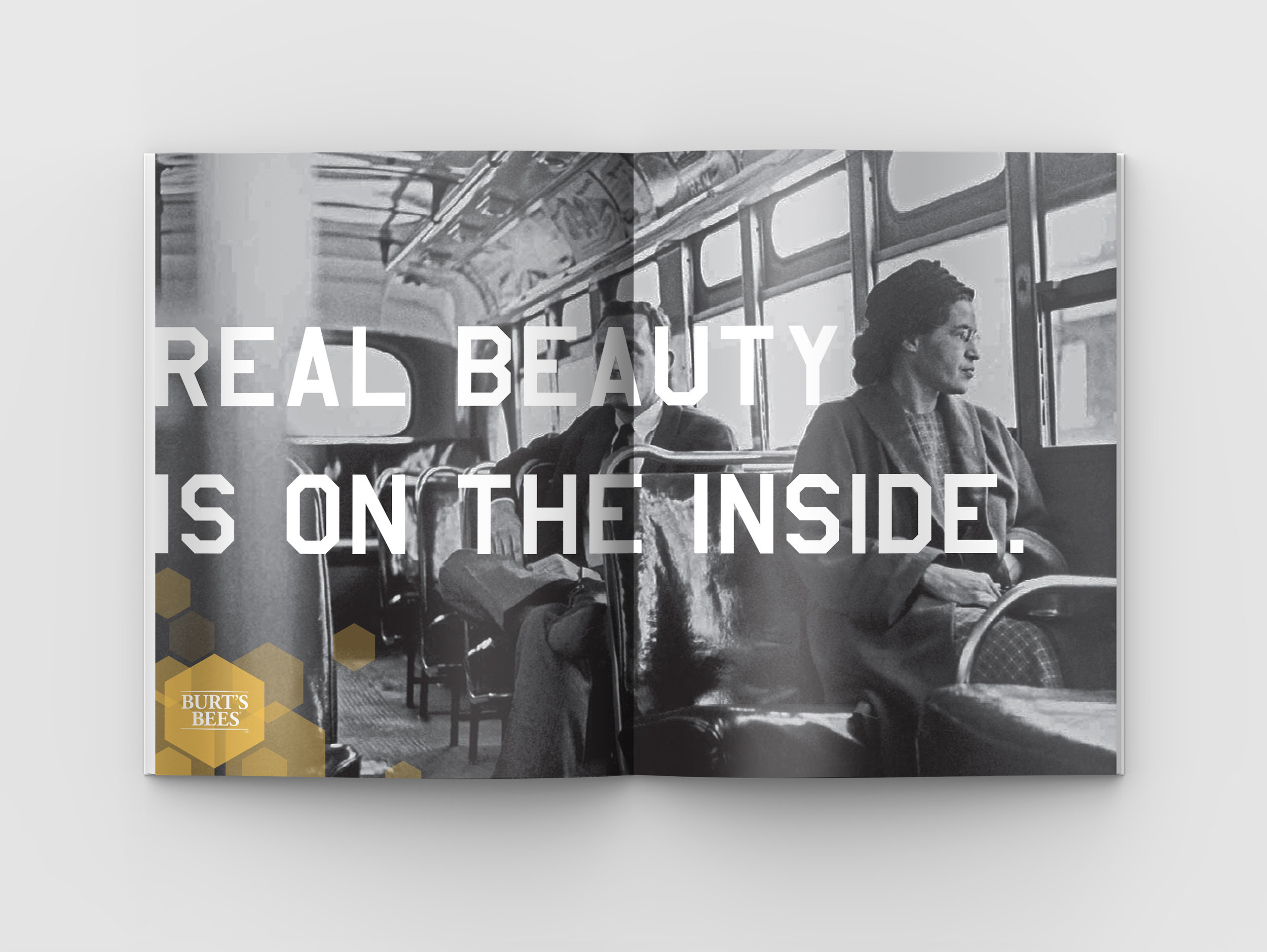
This project was to update Burt’s Bees from a “farmer’s market brand” to a fashion brand without losing it’s soul.
This mantra was used as a setup to pitch them a new campaign:
“It’s easy to look beautiful. It doesn’t take much. If you’re just looking to Coverup. Conceal. Makeup. Then you don’t need us. It’s easy to look beautiful. It’s hard to be beautiful. To care. To have an opinion. To be transparent. To be yourself. To be the real you out there for all to see. To be natural in a world that’s entirely artificial. Some of us find a way. We built a business on bees. On a promise to be 100% natural in everything we do. It’s not easy. But it’s better. Anything worth doing, if you knew what it took, you’d never have done it. Ask these women: Whoever said beauty is only skin deep, didn’t have thick enough skin. Some women look beautiful, others are beautiful. At Burt’s Bees we know the difference.”


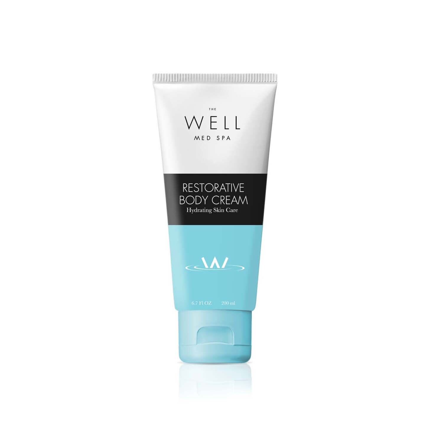
This Scottsdale Arizona Med Spa entered the crowded spa sector with an eye to science, proven technology and clinically trials as a way to stand out in the crowd of snake oil spas offering unproven treatments. The Well is a powerful metaphor and is used a source of the restorative power it offers its clientele. Rising (or lowering into) from these waters brings you back refreshed, revitalized and beautiful. All of this thinking and understanding of clients lead us to the strategic mantra - Beauty taken seriously.
A complete graphic guideline was developed to support the vision of the brand. The vision and mission were laid out along with everything from signage to tote bag design.


This pattern was developed to convey a high end scale and was used on everything from backs of books to tissue paper used to wrap purchases of private label spa products.


Below is a small sample of some of the marks I have designed over the years. Some are for large corporations and others for the likes of my neighbor John’s vet clinic. But in spite the scope or budget, I hope they all reflect my approach to the design challenge they each represented.


While technically not a logo a brand’s whole identity can be wrapped up in their packaging.


